
There are so many web design trends to love: oversized photography, magazine-style typographic layouts, or cinemagraphs. The flip side are those web design equivalents of pleated pants (why oh why are they coming back?), the mullet, or fanny packs. They make our head spin and our skin crawl and we’re not sure how they came to be popular. But somehow, here they are…
Mega Menus
A mega menu is a dropdown interface for a navigation bar. Typically, it is triggered when the user hovers over a link on the nav bar, and it shows all the options in one big “mega” panel. It groups options into related categories and may use icons or other graphics to help the user identify key areas. Sounds highly organized, doesn’t it? So why do people hate them so much?
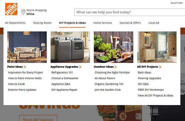
With a mega menu, there’s so much information presented at once that it can take you 30 seconds or more just to figure out what you’re looking at. In a situation where there are so many choices that you “need” a mega menu, it’s probably better to offer high-level categories and a search feature.
Another thing that people hate is that these menus tend to be triggered by hovering, rather than clicking. Have you ever been grateful that you were saved a click? For most people, the answer is no. And for users with accessibility issues who are navigating a website by keyboard, or less savvy users, hover-activated menus are much more difficult to use.
Infinite Scroll
If you’ve ever used an app like Pinterest, you’re familiar with infinite scroll. It’s the most famous infinite scrolling website, and yet even Pinterest hasn’t fixed the fundamental flaw. If you refresh the page, you don’t go back to where you left off scrolling. It’s far too easy for a user to get “lost.” She’ll see something interesting in the first page of results, but is tempted by the scroll to keep going and going. Meanwhile, she has forgotten the interesting results she saw at the top of the page, or, if she remembers, she cannot find them again.
Modal Windows
Modal windows aka lightboxes aka popup windows aka popover windows (yum) are those annoying boxes that appear when you enter a new site, and they generally offer you an exciting chance to create an account or sign up for an email newsletter. We’ve written about modal windows 9 months ago, and they’re still not showing any sign of decline. If you must use a popover, do it responsibly by following the tips in our article.
Hamburger Menus for Desktop Sites
If you’ve used a website on a mobile device, you’ve navigated using a hamburger menu, though you may not have known the whimsical name for them. They look like this:

But what’s up with desktop versions of the site using a hamburger menu? Just use a navigation bar. We’re not getting out the big screen to use a hamburger menu.
Chatbots
When you find a chat option on a website, it’s a jackpot. No picking up the phone; no talking to a human! But if that chat window isn’t manned by an actual person, it’s the worst. The only correct answers you’ll get will be the most mind-numbingly obvious ones. What is your phone number? What is your address? If it’s an answer that needs some nuance, well, the chatbot AI is not there yet.
Have you seen a web design trend that bugs you? We’d love to hear about it—so we can avoid it for our next project.
